
Honey first
Honey yellow is the brand. If a layout only gets one colour, it gets honey. Cream, sand and butter pace a long page; coral appears only where someone can act.


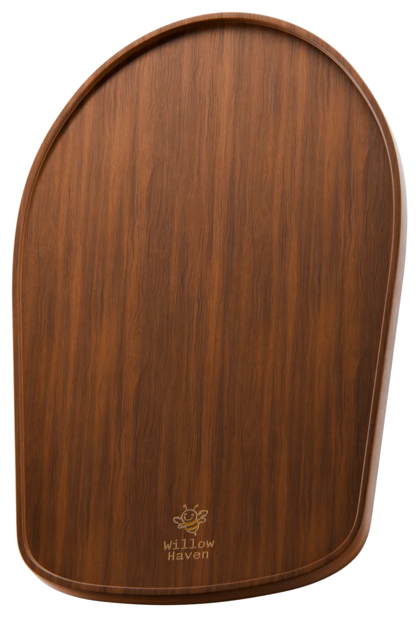
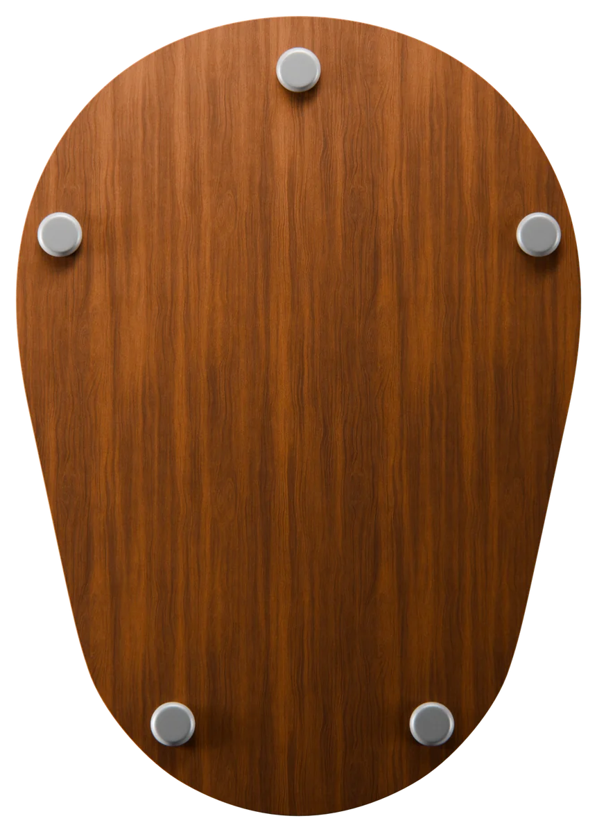
Everything that makes Willow Haven look, sound and feel like Willow Haven: honey-yellow boards, a hand-drawn bee, Garamond headlines, a coral brushstroke, and plain words about kitchen annoyances. Use this book for the website, ads, social, packaging and anything else that carries the name.

00The idea
Willow Haven makes wooden sliders and accessories that let a heavy stand-mixer glide out with one hand. The brand should feel the same way the product does: warm, simple, a little cheeky, and built to last.
Honey yellow is the brand. If a layout only gets one colour, it gets honey. Cream, sand and butter pace a long page; coral appears only where someone can act.

The bee, the Freehand icons, the dashed flight path and the brushstroke are all made by a hand, never by a ruler. Keep lines slightly imperfect and always in one ink.

Name the kitchen annoyance, then the fix, in short sentences. “No more tug of war. No more scratched benchtops.” No jargon, no emoji, no hype.
01Logo
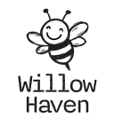
The detailed bee is the main logo. The main lockups come as vectors in logo ink (#231F20) and in white; a few exist in ink only and stay on light grounds. Keep clear space of at least the height of the bee's head on every side.
Main logo. Favicon, avatar, product branding and box sides.



02Colour
Honey is the ground for the site, ads, social and the box. Cream, sand and butter give a long page rhythm. Coral means “act here” and nothing else. Select a colour to copy its hex.
A Willow Haven layout is mostly honey, with cream and sand for rhythm, one line of ink for text and a single coral action.
Honey · Cream · Sand · Butter · Ink · Coral
03Typography
Garamond speaks for the brand, Poppins does the reading, and Nitti Typewriter signs the name. Never swap their jobs.
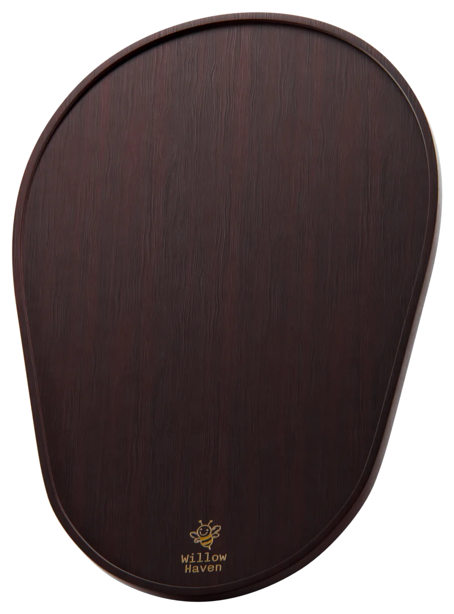
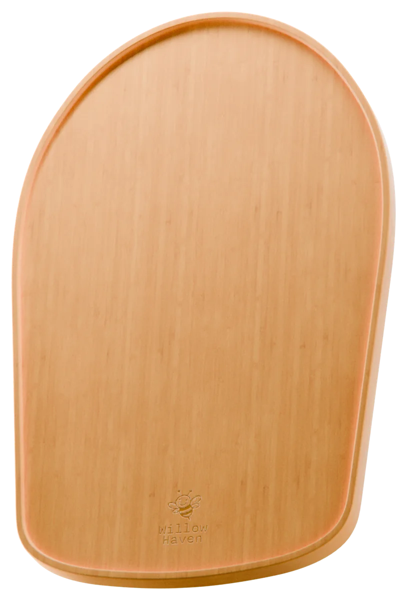
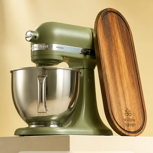
Acacia, bamboo and ebony walnut, cut to fit your mixer.
Stays put while mixing. Slides only when you push it. Every KitchenAid tilt-head and bowl-lift model has a slider cut to its base.
Get 10% off
04The paint stripe
A hand-painted coral stroke sits under the hero headline. It is the brand's signature, so it stays rare: one per view, only under a Garamond headline.
72% of the headline · 9px below
Left-align it with the headline, about 72% of its width, 9px under the last line. Use it on honey, cream or dark photography.
Put it under buttons, prices or body text, stretch it, recolour it, flip it, or use it on the box.
05Iconography
Streamline Freehand icons, drawn with the same wobble as the bee. Black only, 20px and up, and always next to a few words. The full library holds 551; these are the ones you'll reach for.




















 Move your mixerNo more scratchesEco-friendly wood,
06Photography
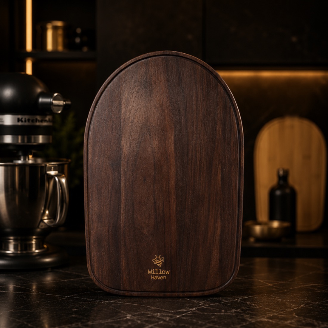
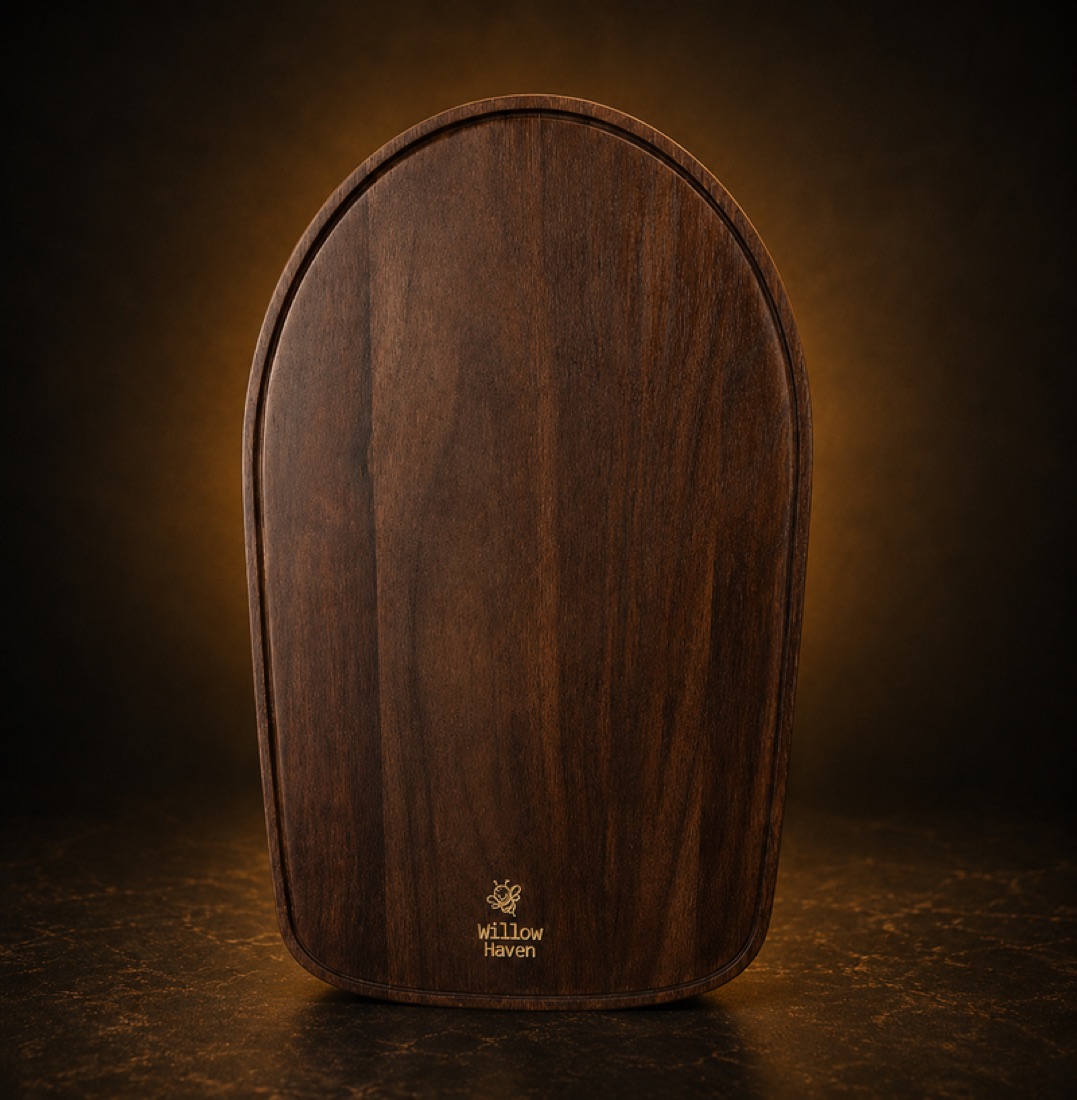
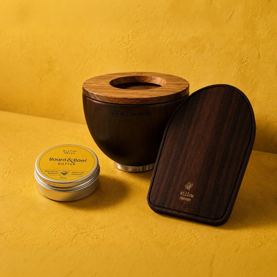
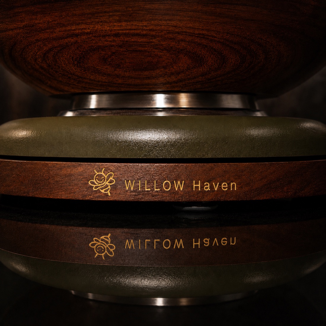
Dark woods live in the dark: black cabinetry, dark marble, a black or chrome mixer, and a warm glow behind the board so the grain and the edge show. Never shoot a dark slider on a pale background.
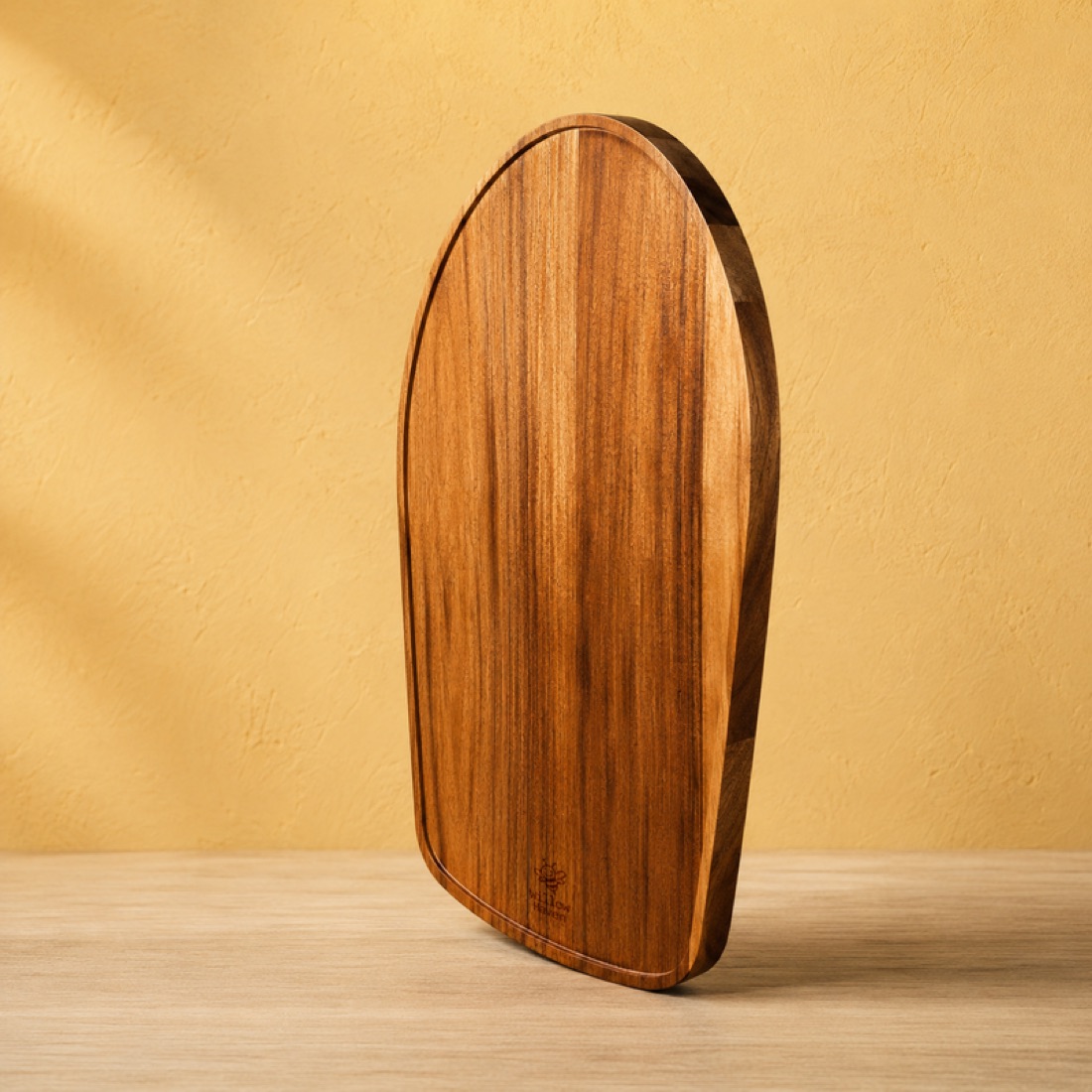
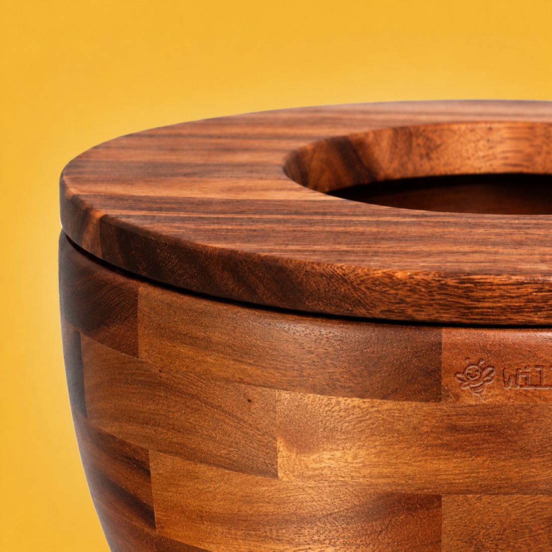
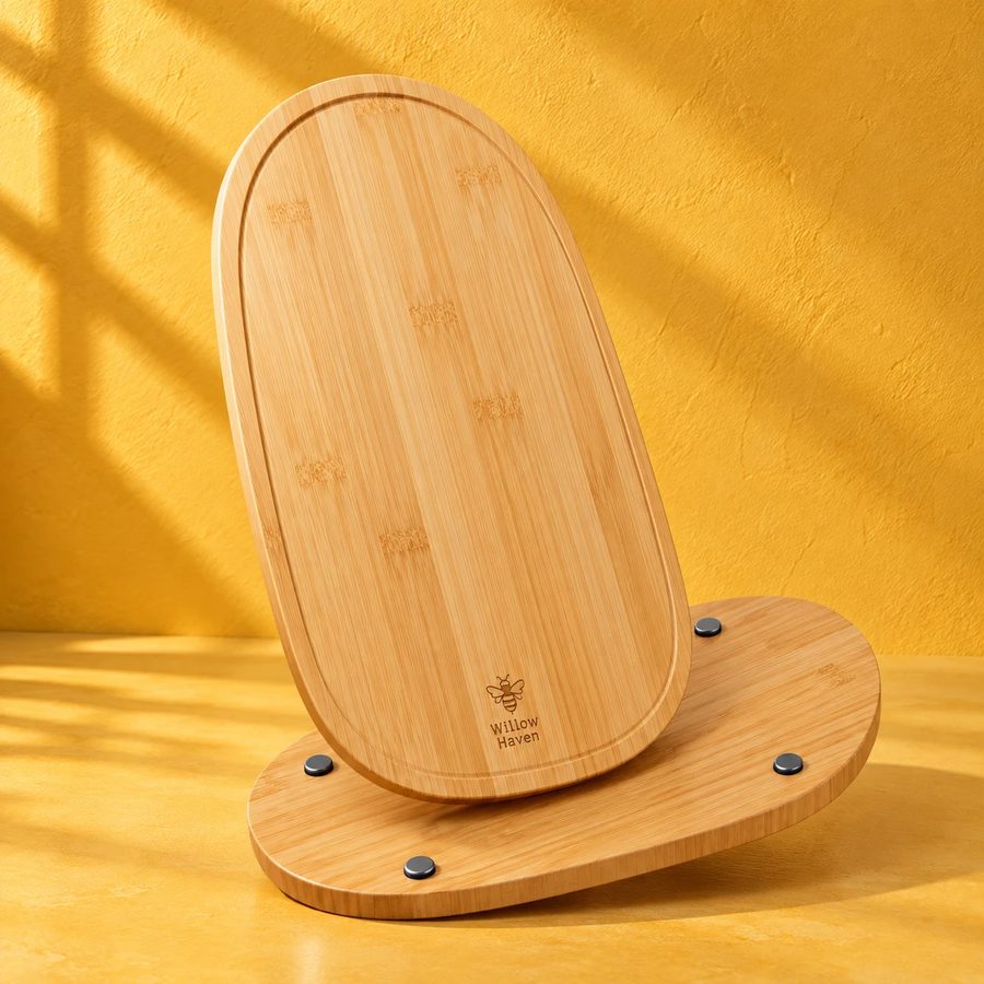
Bamboo, acacia and the accessories: pale benchtops, butter-yellow or cream mixers, soft window light. Square crops on cards, full-bleed landscape heroes.
07Packaging
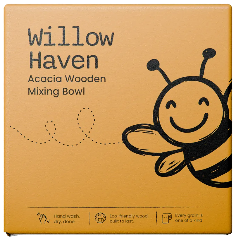
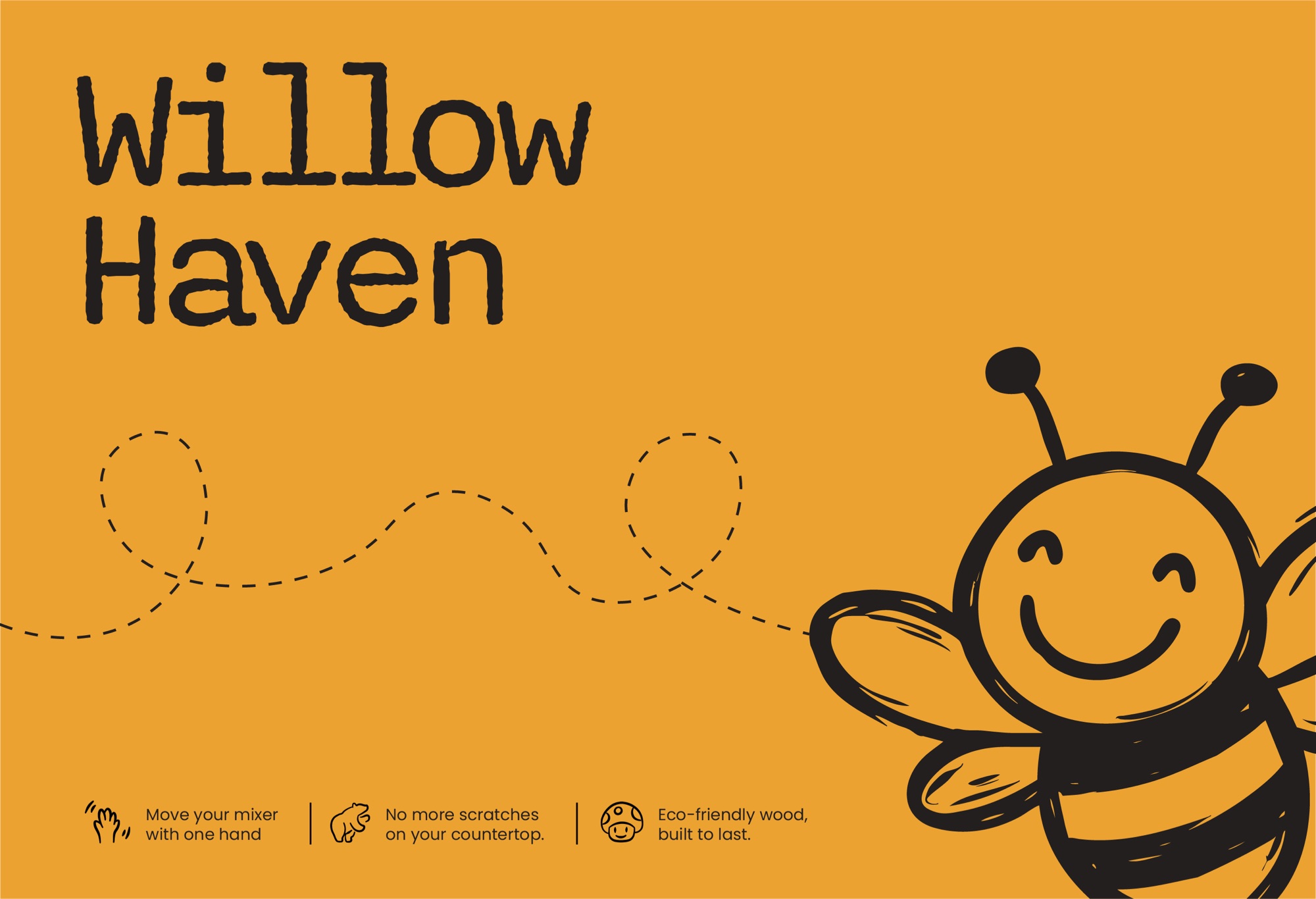
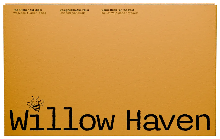
A flat honey board in one ink. The name set huge, the bee flying in from the edge, and three honest benefits along the bottom.
Two boxes, one family
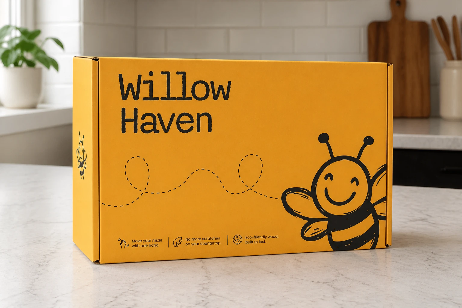
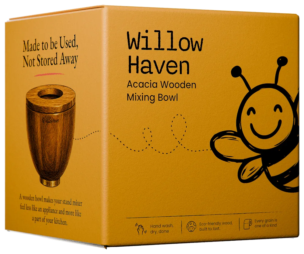
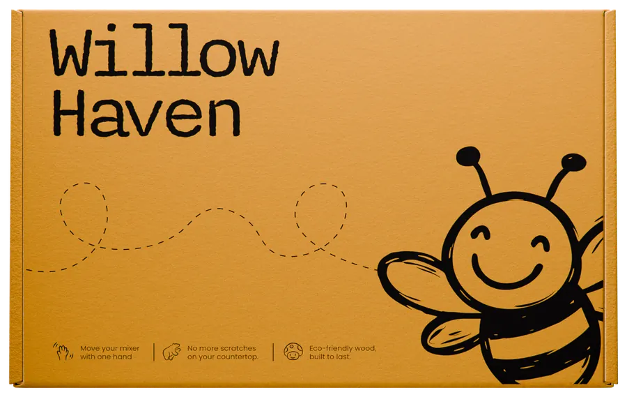
Same honey board, same ink, same bee, but they do different jobs. The bowl box carries a product photo, a Garamond promise with the coral stripe under it, and a note from Koen on the back, because a shopper has to get it in one glance. The slider box arrives by post, so its lid is the wordmark, the bee and three benefits, nothing more.
Walk around the bowl box
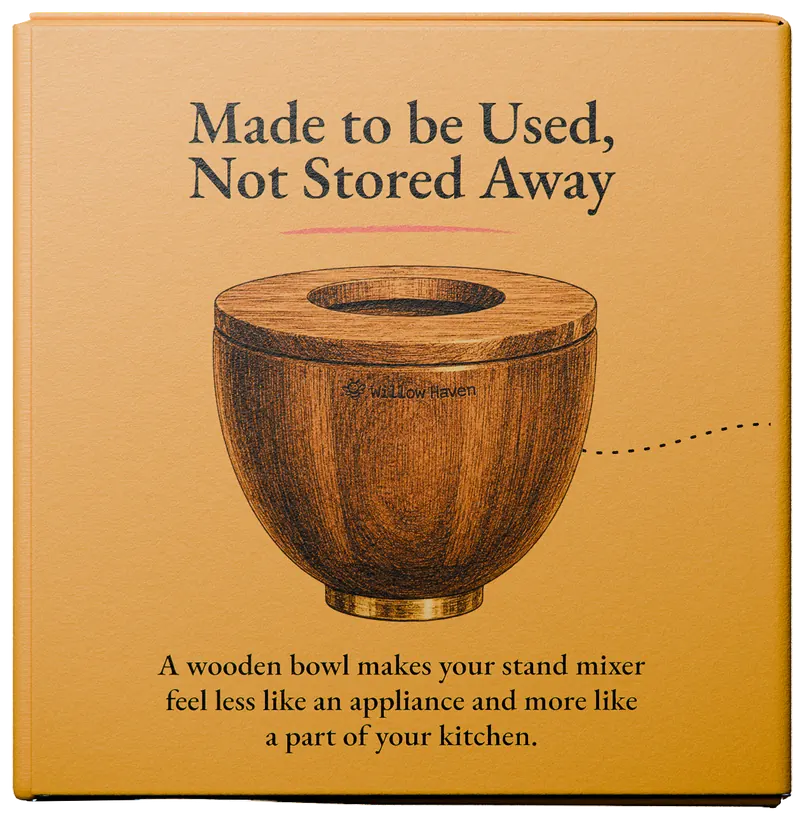
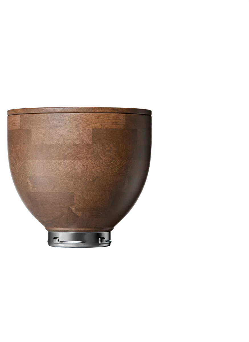
Front“Made to be Used, Not Stored Away”, the coral stripe under it, the bowl straight on, and one line of reason.
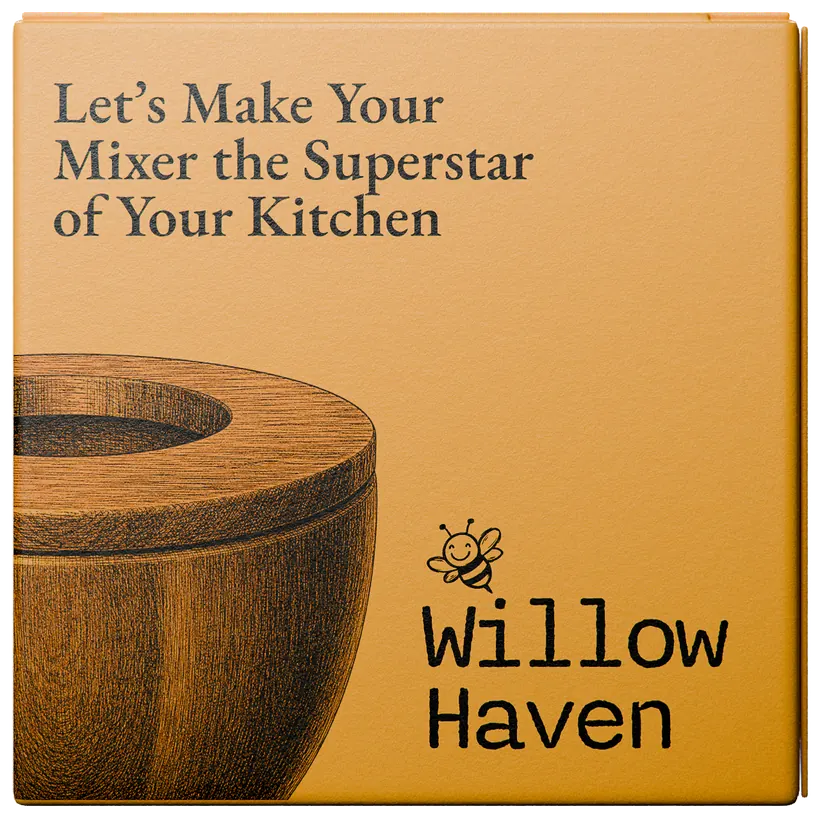
Side“Let’s Make Your Mixer the Superstar of Your Kitchen”, the bowl from above, and the wordmark closing the panel.
Bee sideWordmark and product name top-left, the bee flying in from the right on its path, three icons with a line each along the bottom.
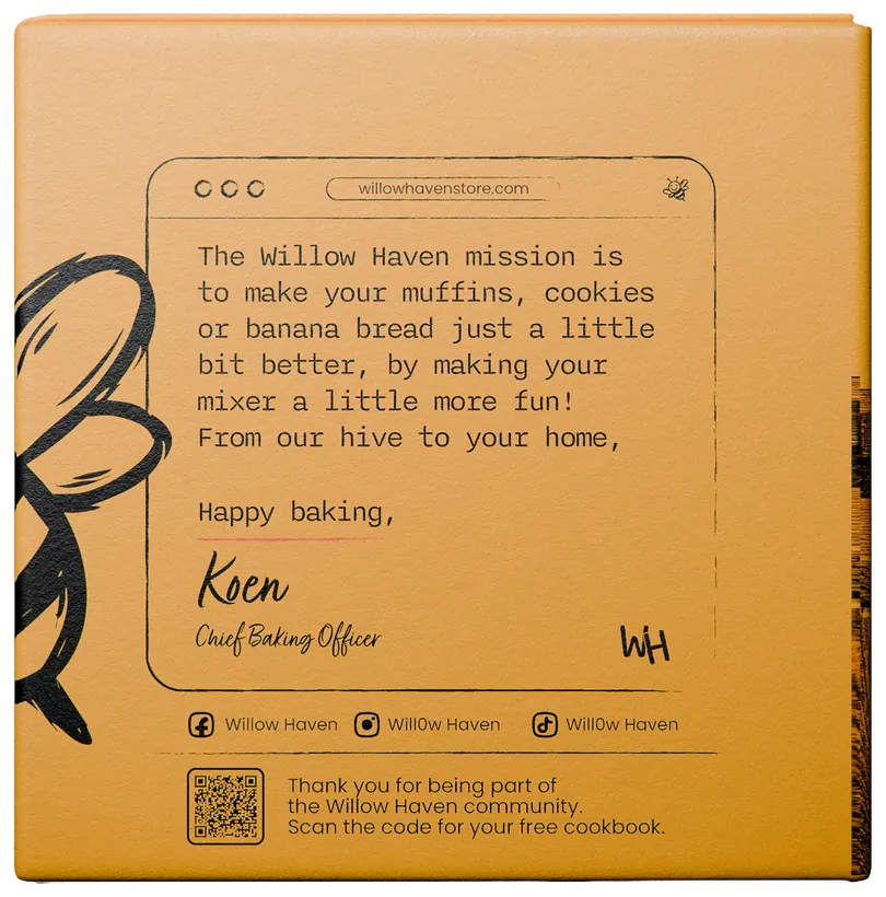
BackKoen’s note in Nitti, signed as Chief Baking Officer, the social handles, and the QR code for the free cookbook.
The slider box, flat



08Ads
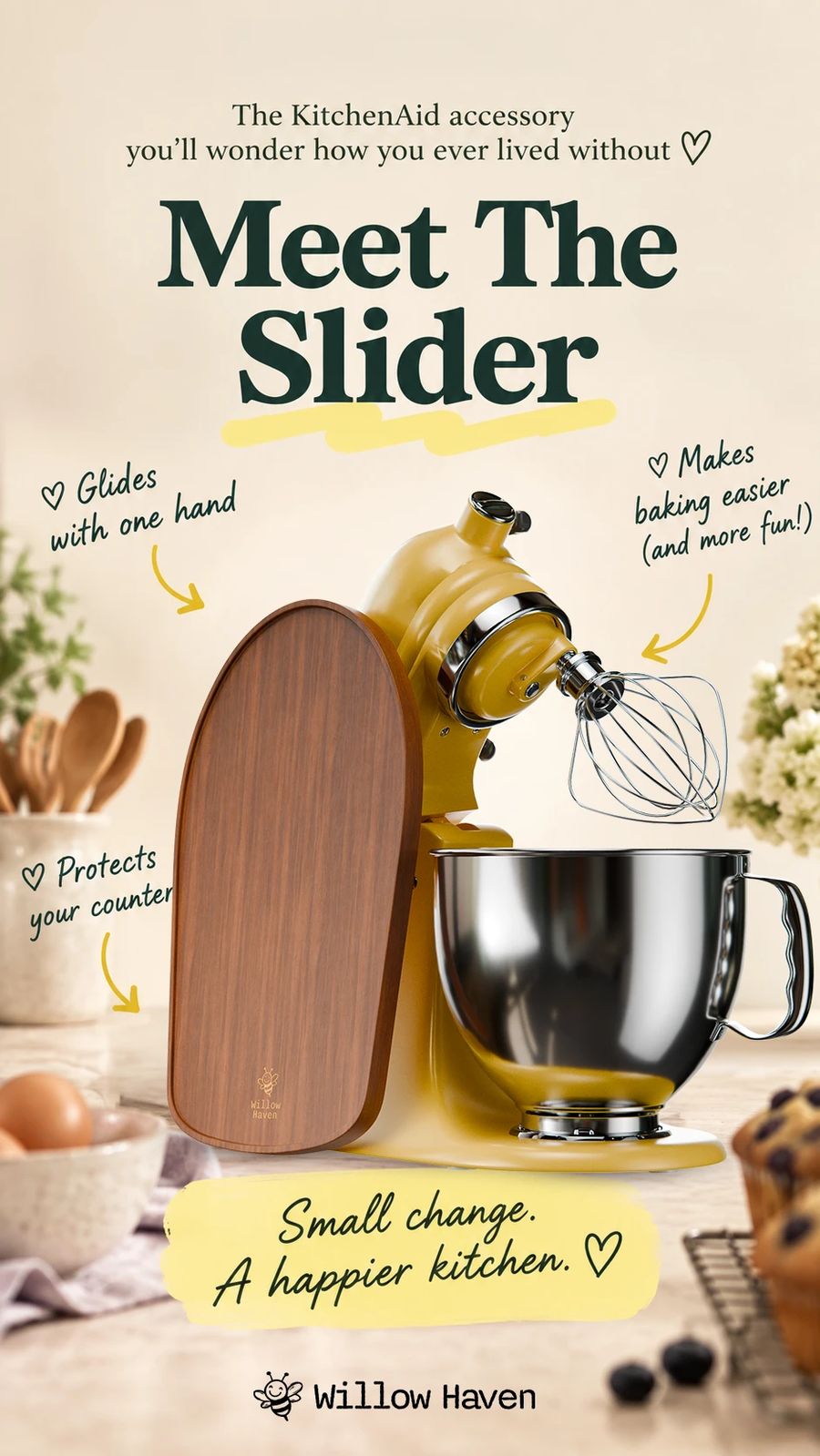
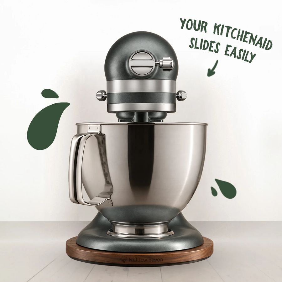
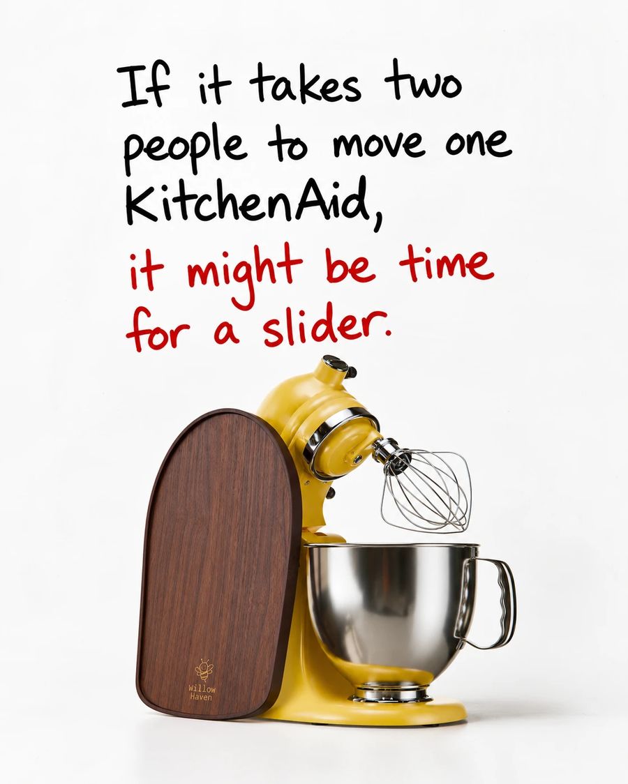
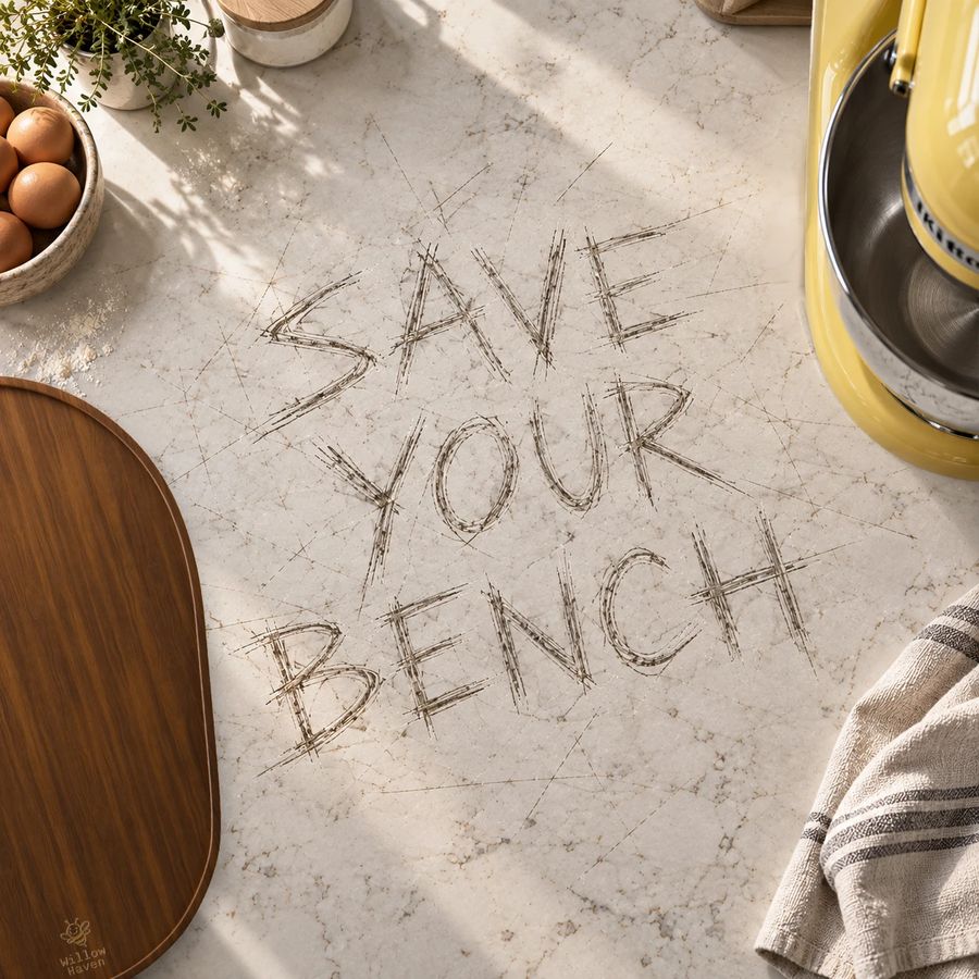
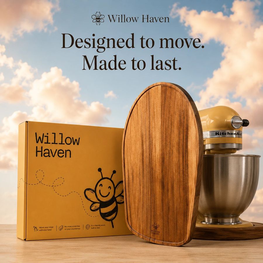
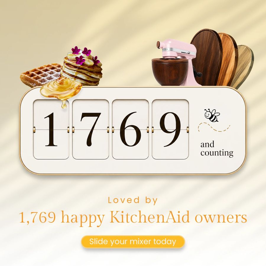
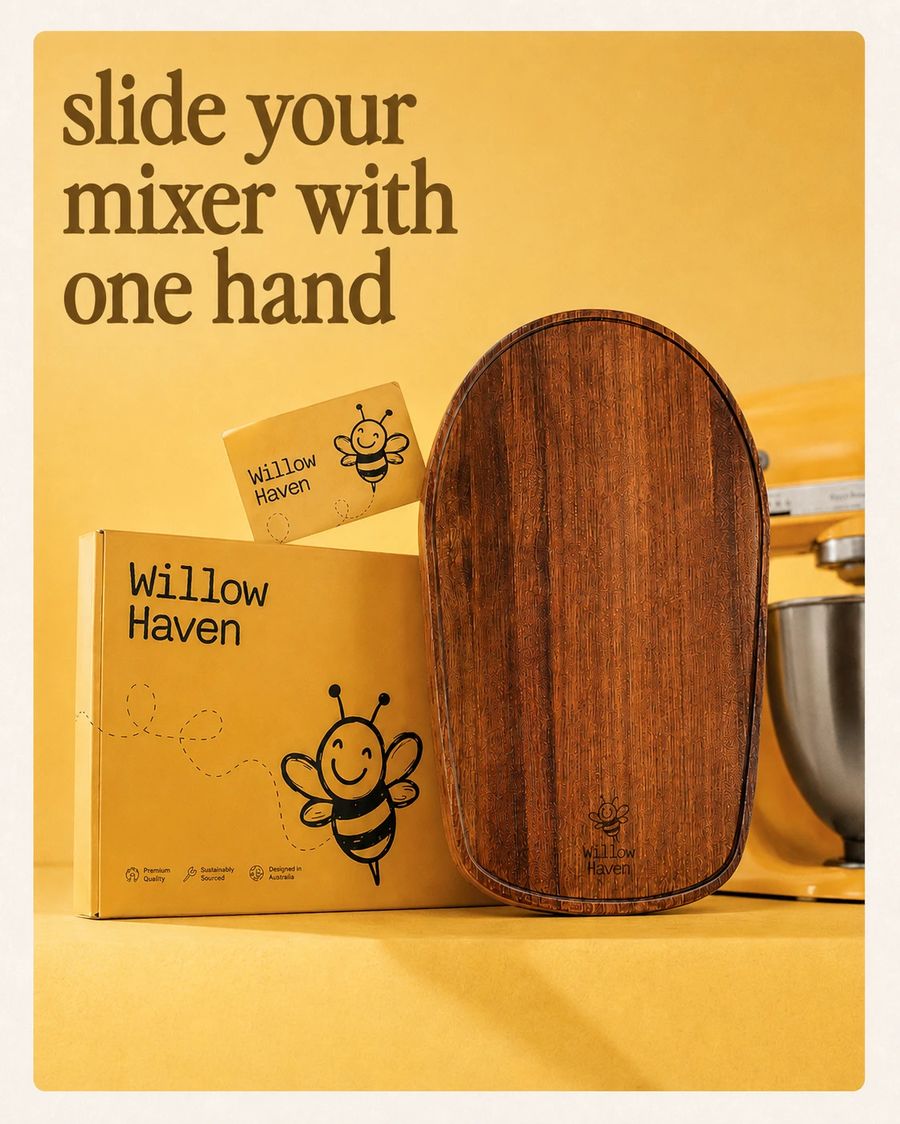
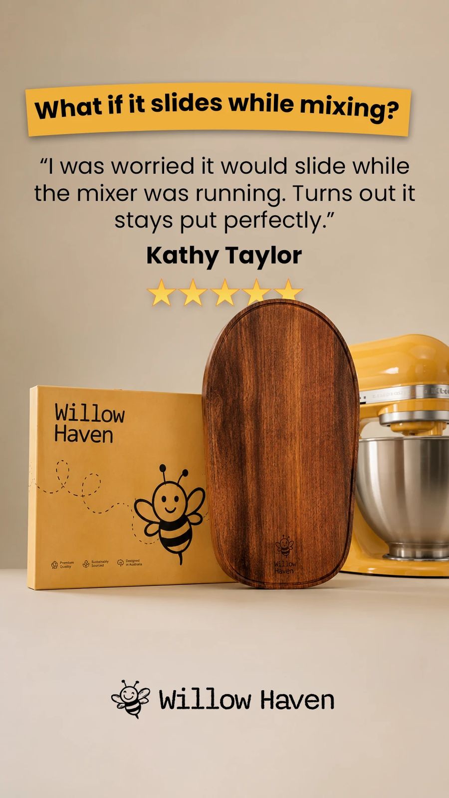
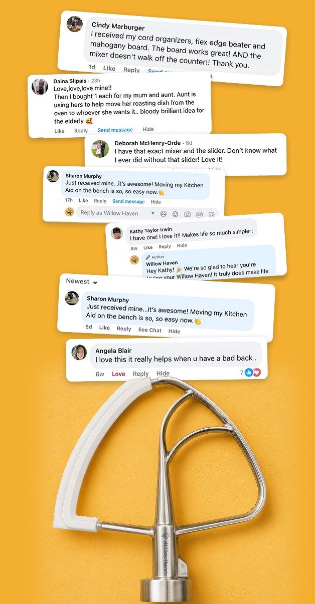
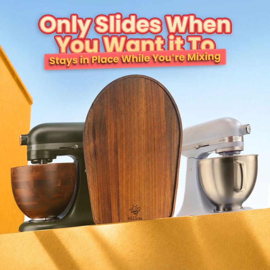
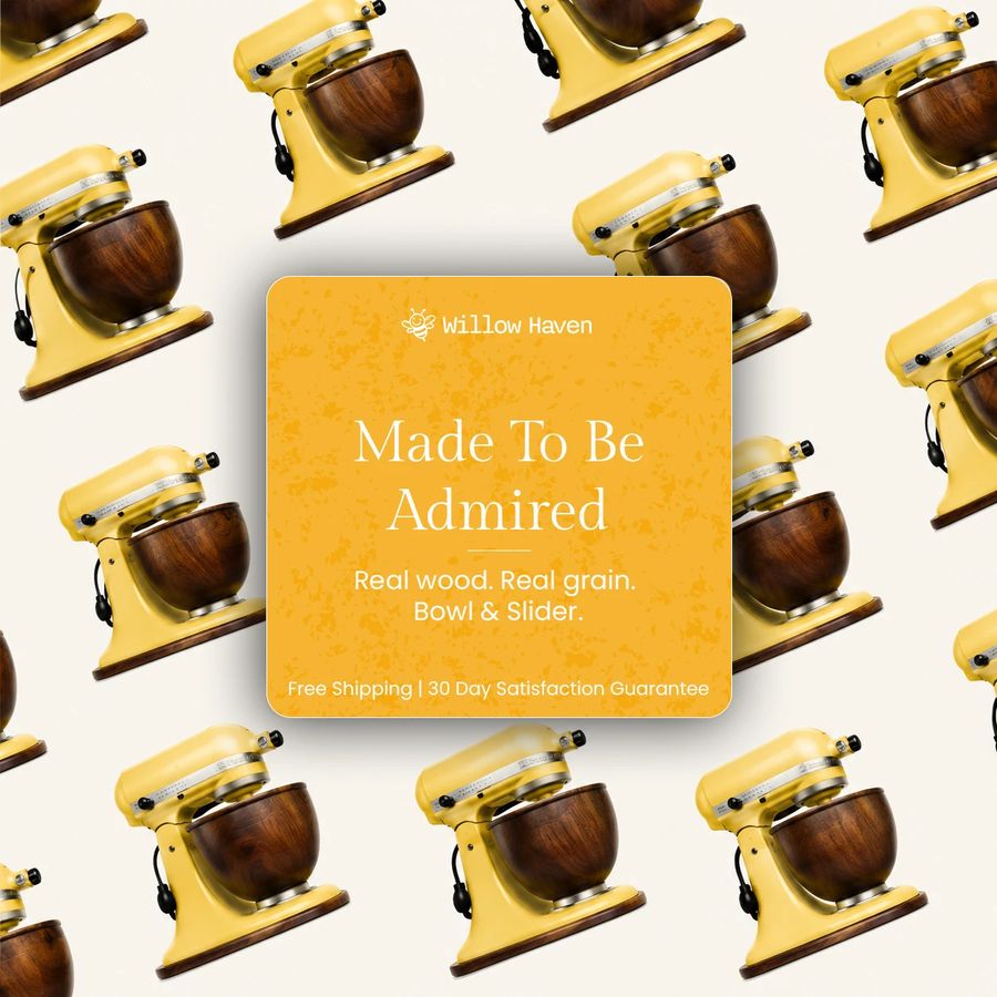
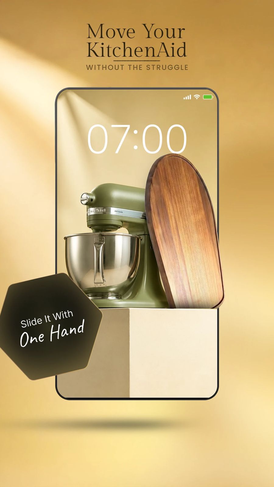
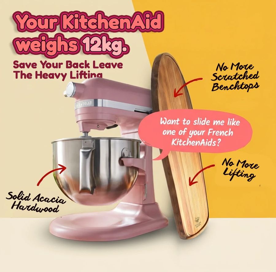
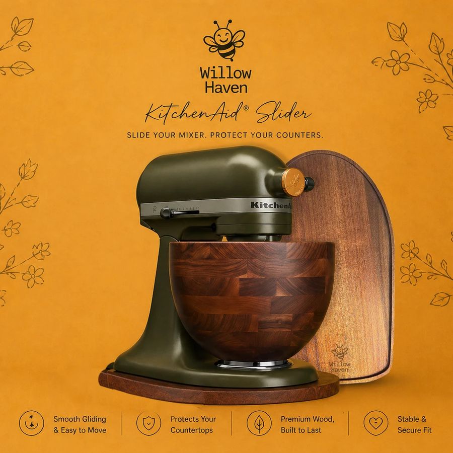
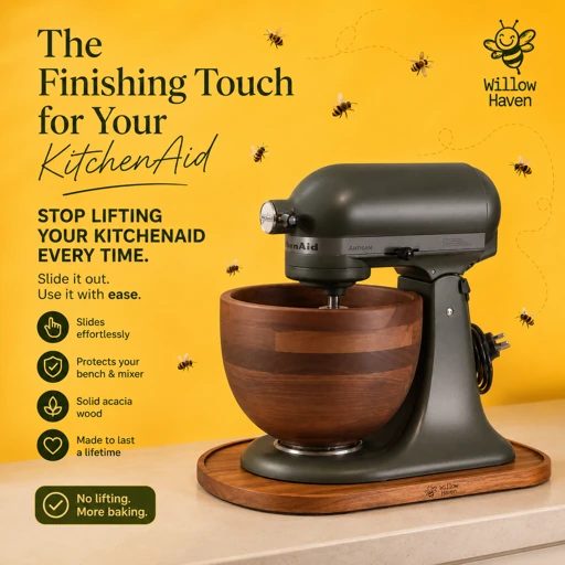
Fourteen ads that got it right. Use them as the reference for every new one: the slider and a real mixer take the frame, one idea carries the headline, and the proof is real.
09Creator video
Creators film the slider the way they'd film anything else in their kitchen: phone, daylight, one take. It looks nothing like an ad, which is why it works. These three set the bar.
10CGI
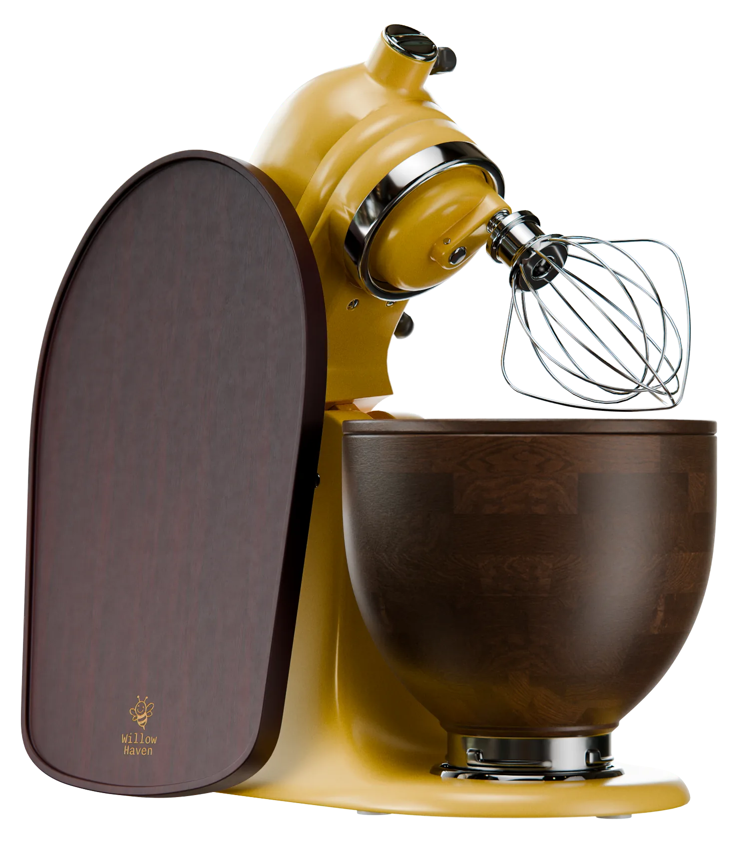
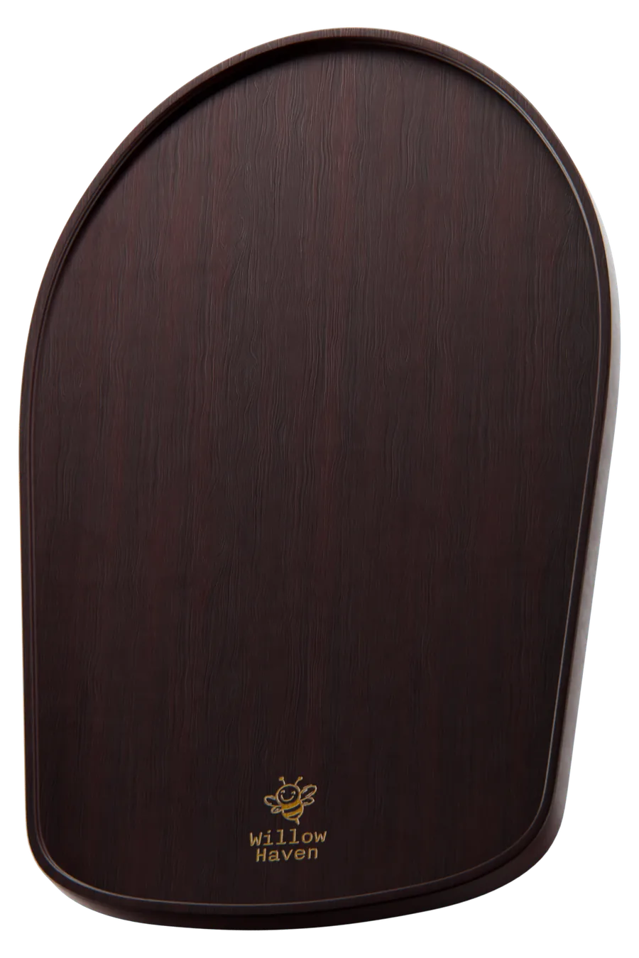
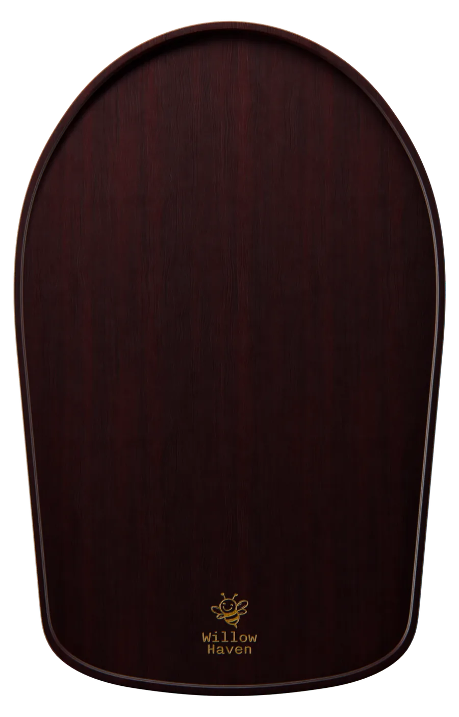
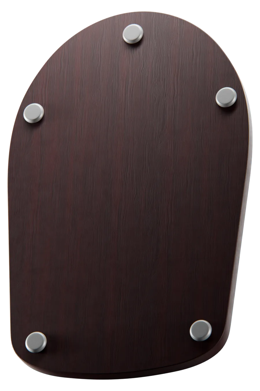
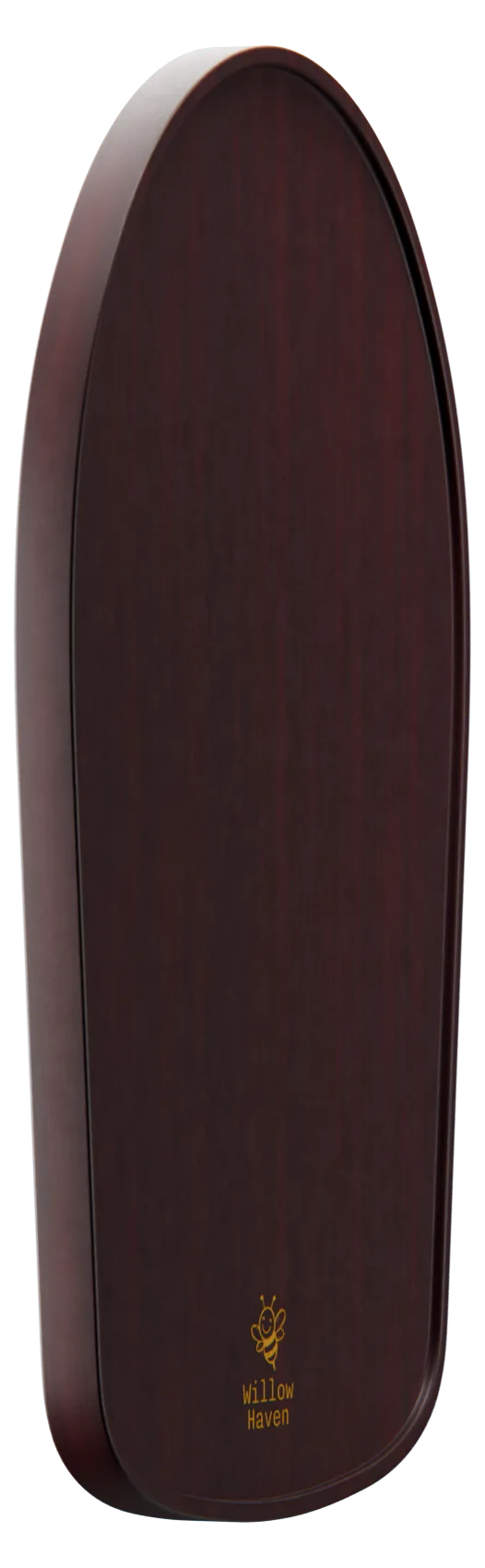
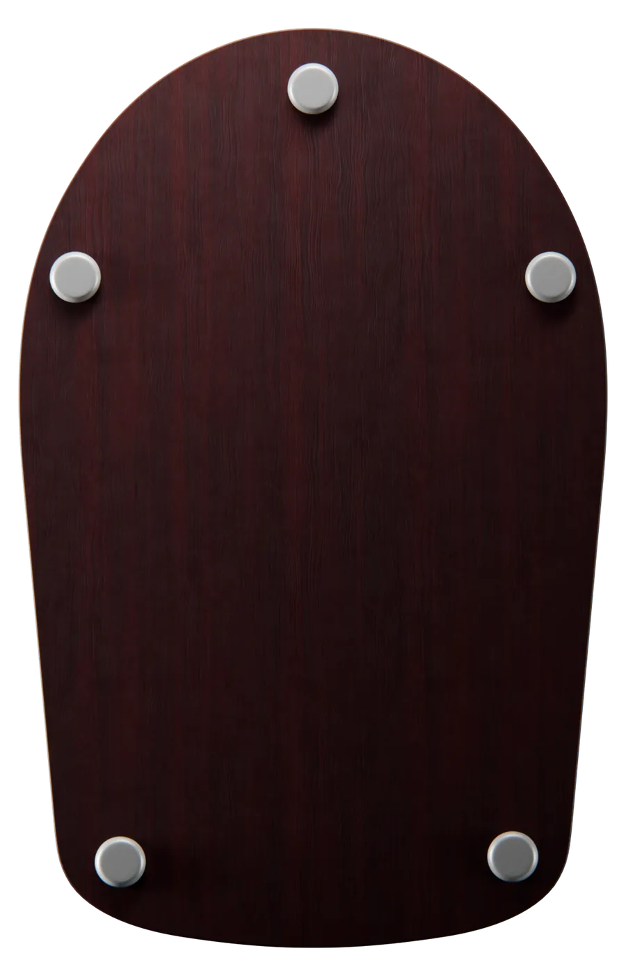
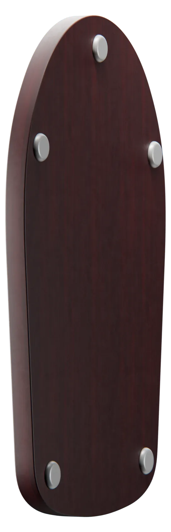
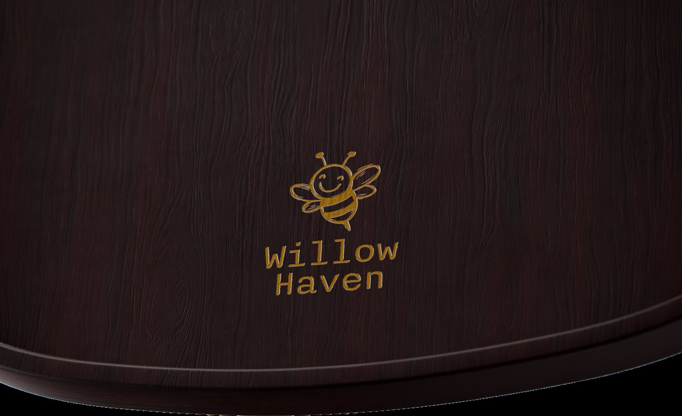
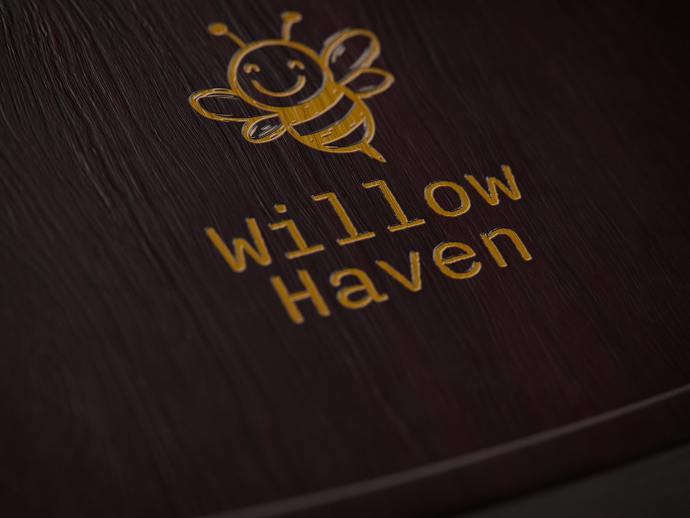
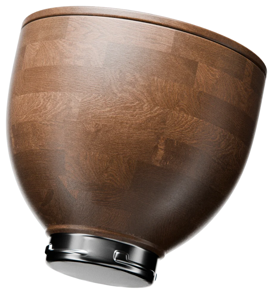
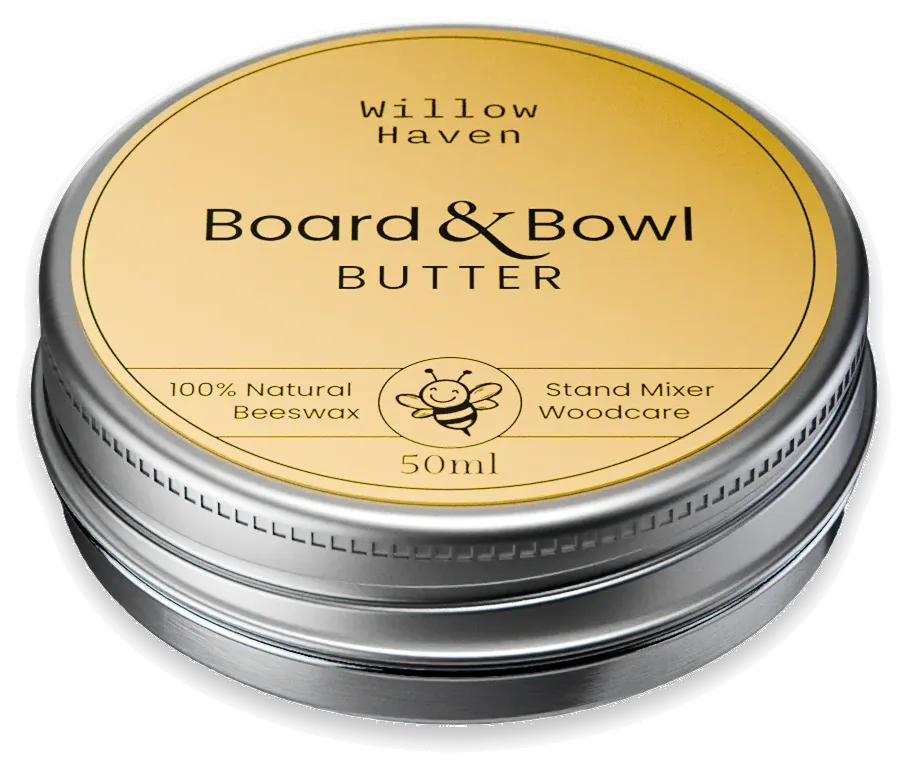
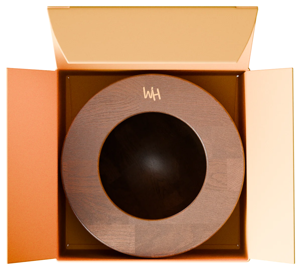
The products exist as CGI too: a studio-lit film and transparent cutouts of every slider, bowl, tin and box, from every angle. Use them where photography can't go: configurators, size guides, engraving details, ads that need a clean cut.
Build yours
Ebony walnut, for the tilt-head 4.5–5 Qt models.
Every angle · walnut, square

11AI imagery
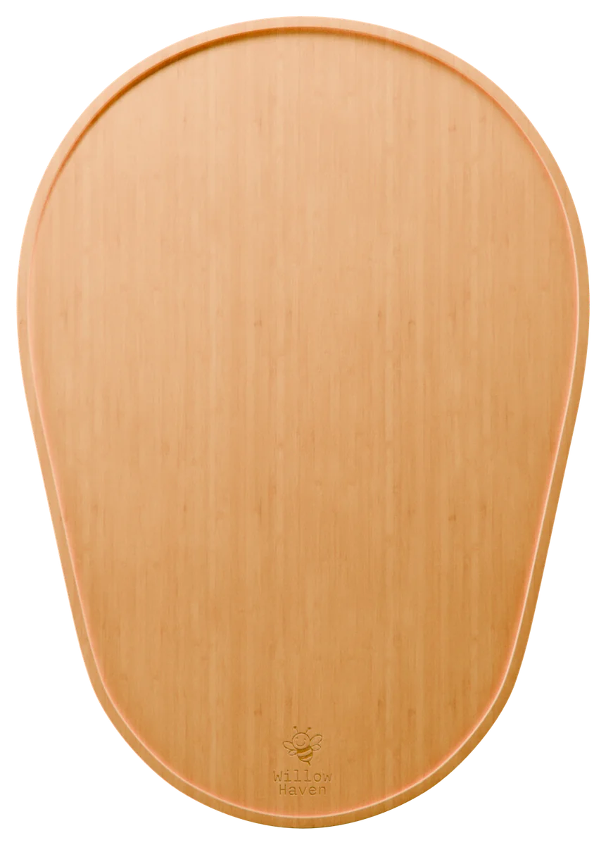
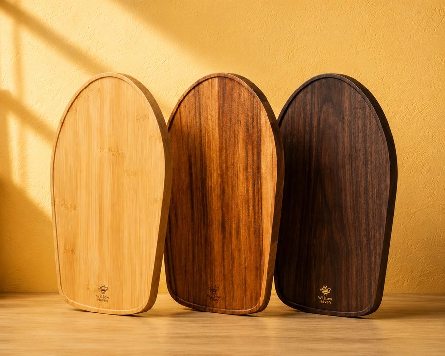
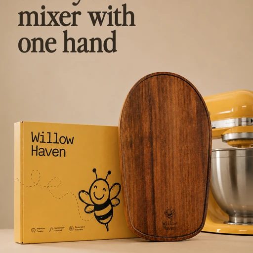
AI tools are welcome for sets, light, props and people. The rule is simple: everything Willow Haven makes has to match reality one to one. The board shape, the engraving, the box, the tin, the woods. If it isn’t exactly what ships, it doesn’t ship.
✓ Allowed: made with AI, true to the product
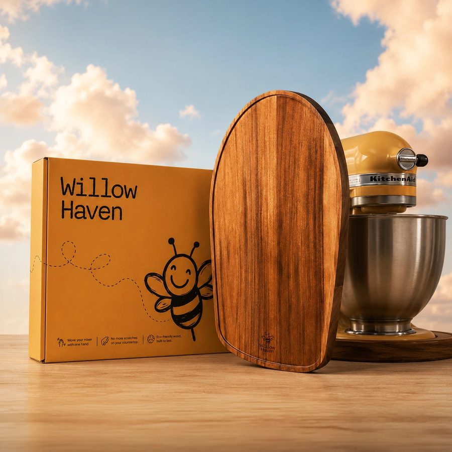
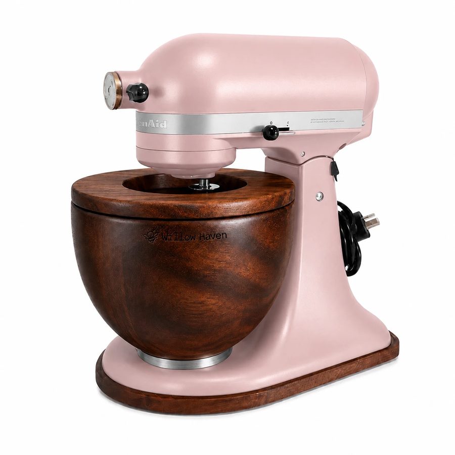
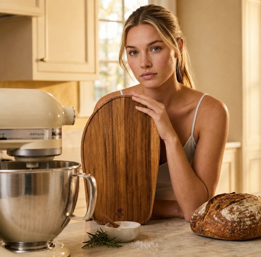
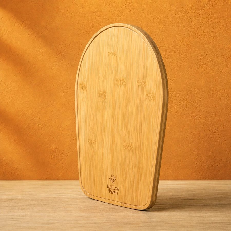
✕ Not allowed: the product has been redesigned
Before an AI image goes out
Put a product photo or a CGI render next to it. Every point below has to match, or the image is retouched or dropped.
12Voice
Practical, friendly, a little cheeky. Talk to “you” and “your mixer”. Australian spelling, prices in AUD, KitchenAid® with the ® on first mention.
“The cord on your KitchenAid® mixer is too long and always in the way.”
“Your stand-mixer glides out with one finger and sits exactly where you left it.”
“No more tug of war. No more scratched benchtops.”
| Element | Case | Example |
|---|---|---|
| Hero and section headlines | Title Case | The Slider Range |
| Subheads, body, errors | Sentence case | Free shipping on every order |
| Buttons and labels | Sentence case, uppercased by CSS | Add to cart → ADD TO CART |
| Wordmark and offers | As written, in typewriter | Get 10% off |
13Components
One coral pill per view for the purchase, square cream controls for everything else, and a 2px ink focus ring on every one of them. Labels on coral are ink (6.2:1); the live store still uses white (3.4:1), which new work should not copy. Try them.
 Sale
SaleNow go make something honey-coloured
Logos, fonts, colour tokens, icons and packaging artwork live in the Willow Haven design system.